When our clients sought our expertise to modernize their beloved home, we knew it was a chance to infuse fresh energy and comfort into every corner. The goal? To craft an updated, airy, and inviting space that embraced the essence of modern living. We had beautiful bones to work with, so it wasn’t hard to turn this home into a haven!
From the get-go, we recognized the challenge posed by the home’s dim interiors. While the living/ dining room was brightly lit, the bedrooms were another challenge altogether. Our mission was clear: to usher in a sense of lightness while tastefully integrating splashes of color and organic elements throughout the design palette.
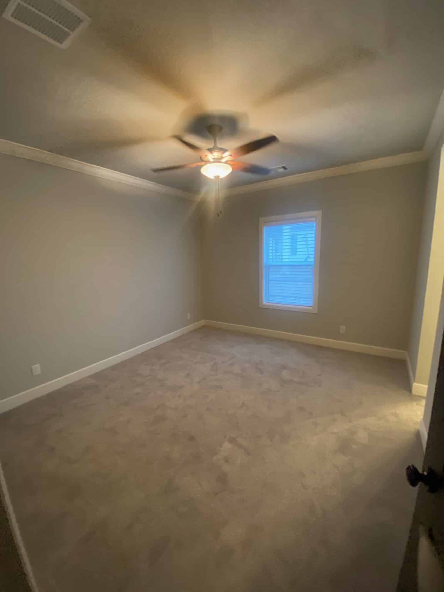
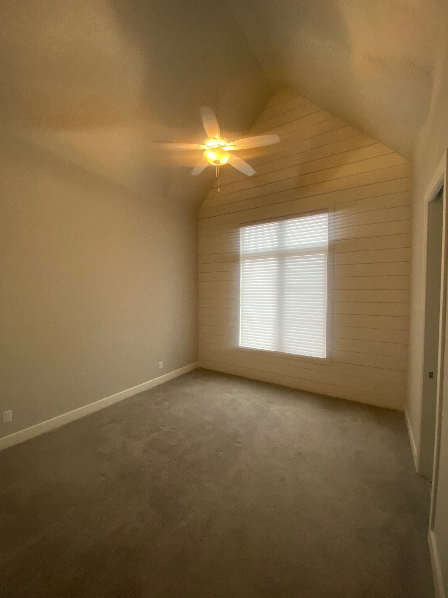
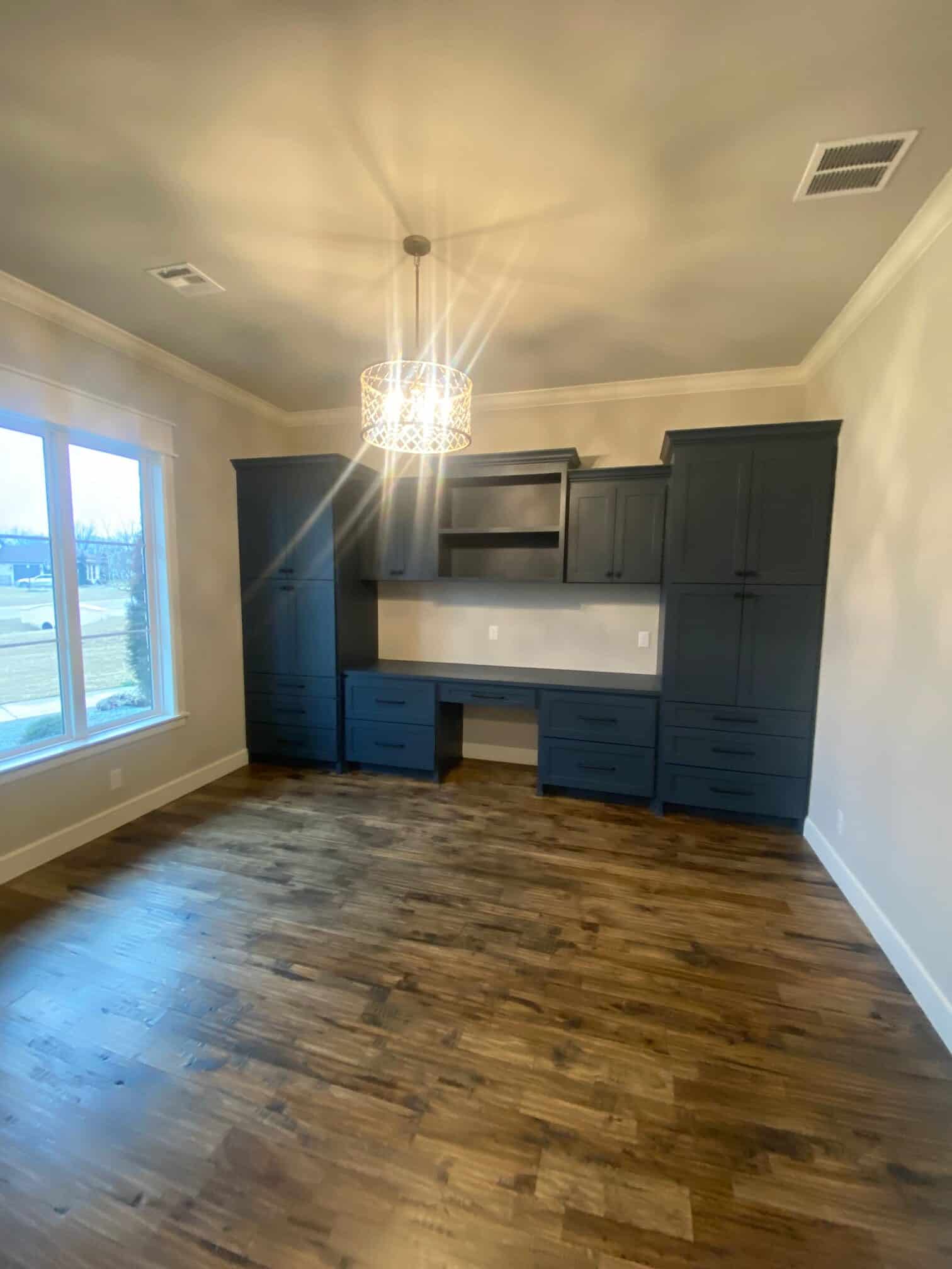
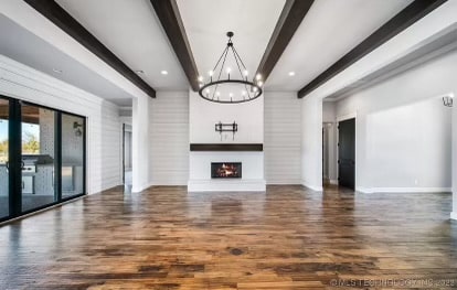
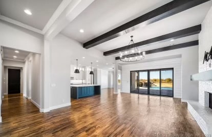
As you can see, while spacious and a wonderful blank canvas to work with, the lighting was the main issue to be addressed.
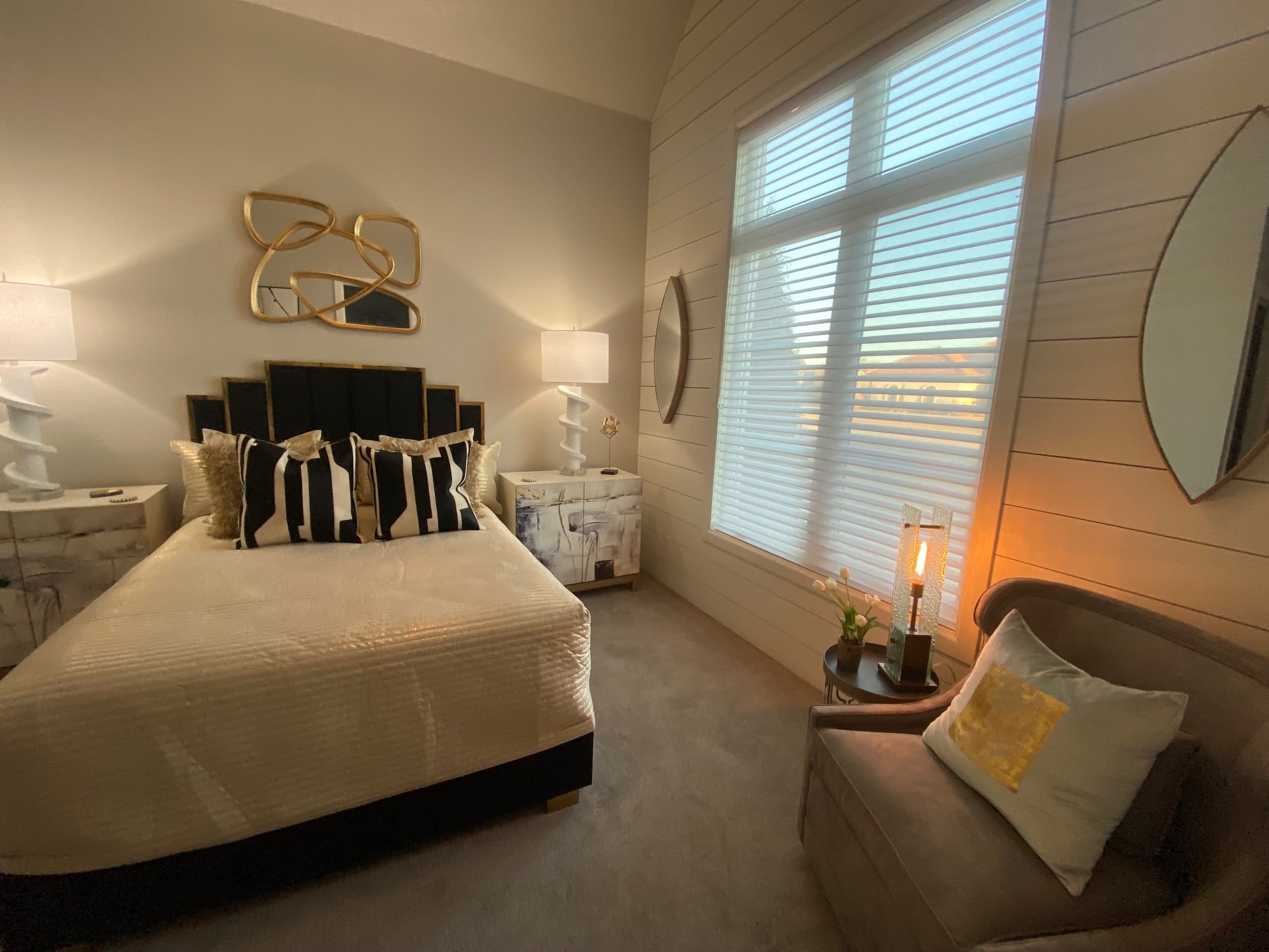
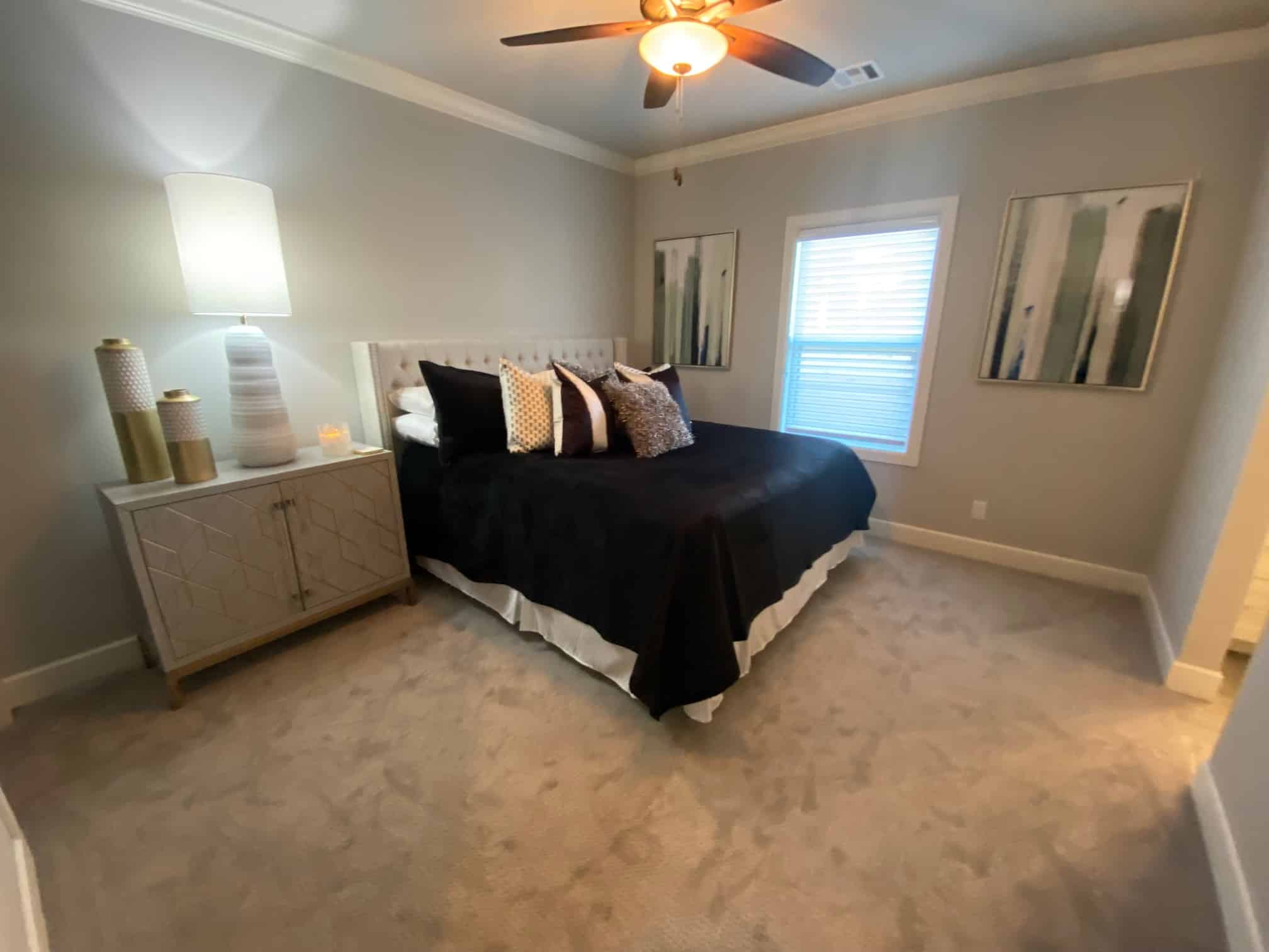
In our endeavor to revamp the guest bedrooms our mission was clear- balancing style with practicality. We carefully curated each element to ensure both visual appeal and comfort.
From the inviting bedding with a mix of textures and tones, to the selection of furniture, every detail was chosen with our guests’ comfort in mind. The art selected was chosen to add a touch of personality to the space, while gentle lighting complemented the natural glow through the windows.
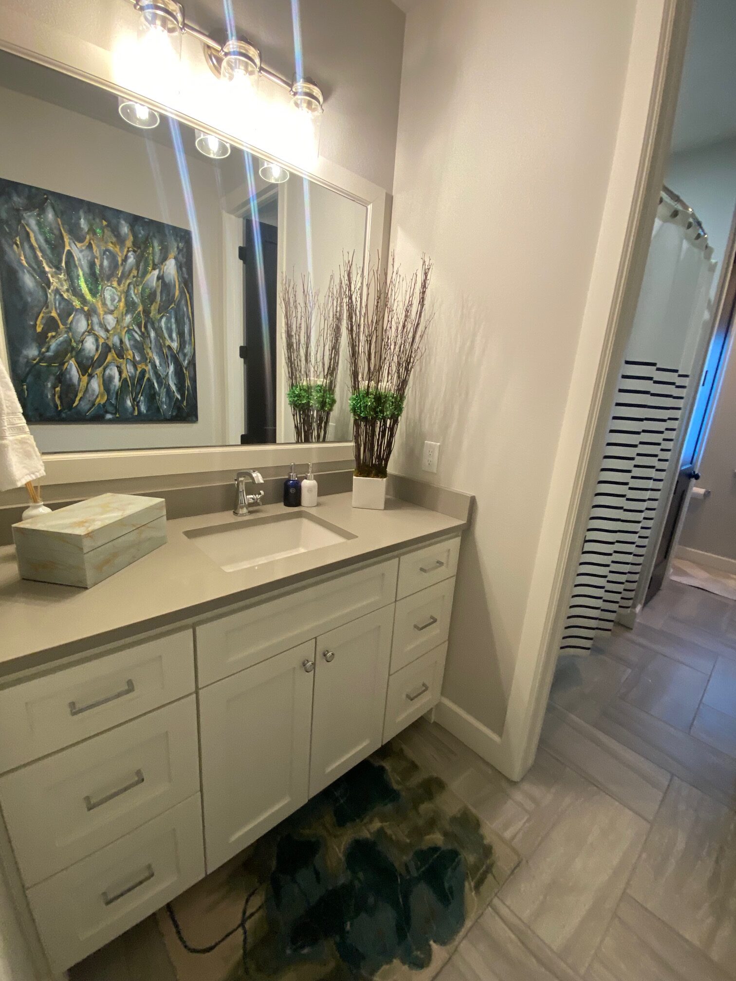
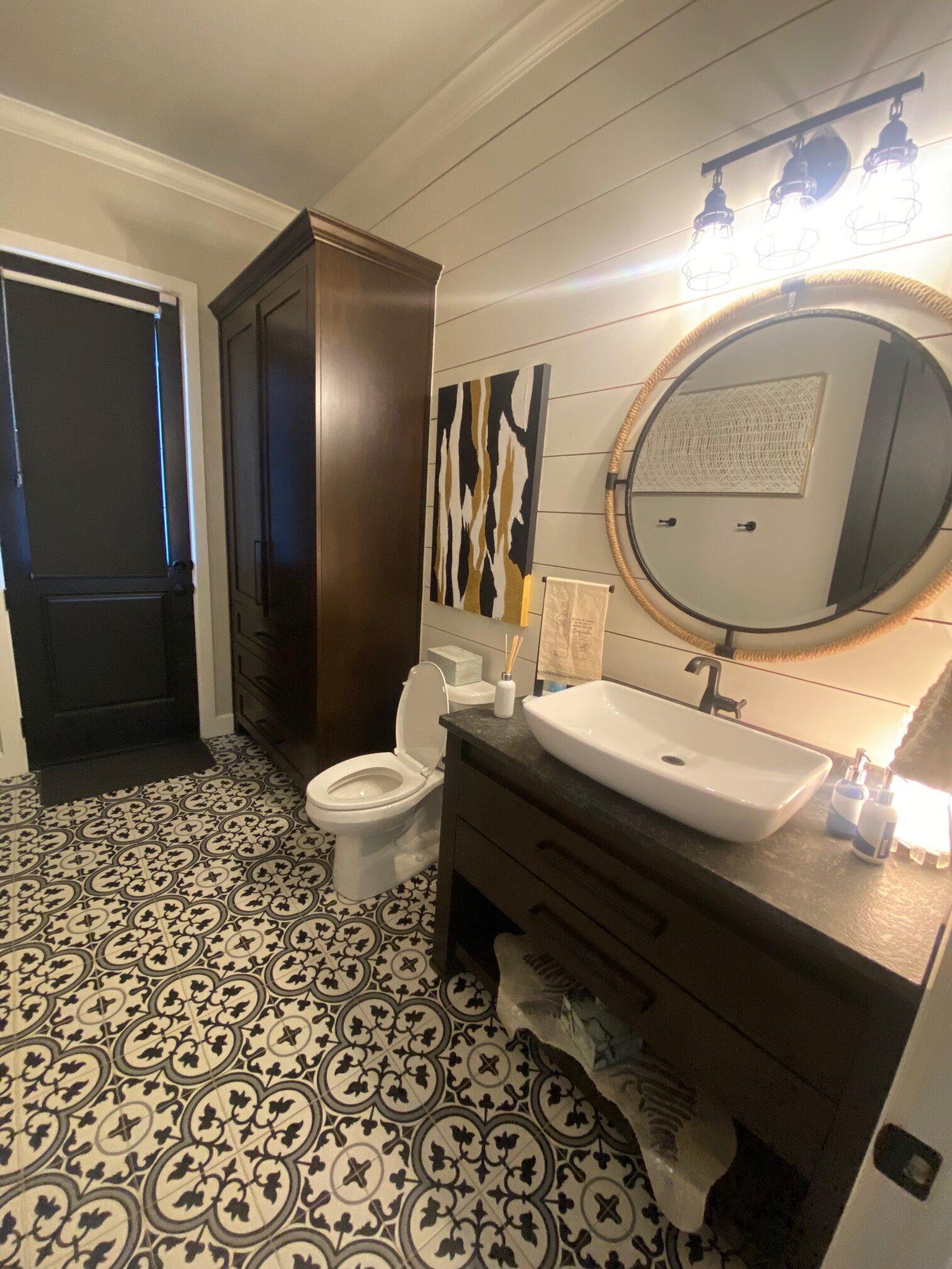
In the bathrooms, we opted for bold and modern. Bold patterned floors added a touch of drama, while sleek fixtures offered a modern touch. Wooden accents provided warmth and character, creating a harmonious balance between rustic charm and contemporary design. Practical amenities were thoughtfully integrated into the space, ensuring convenience without compromising on style.
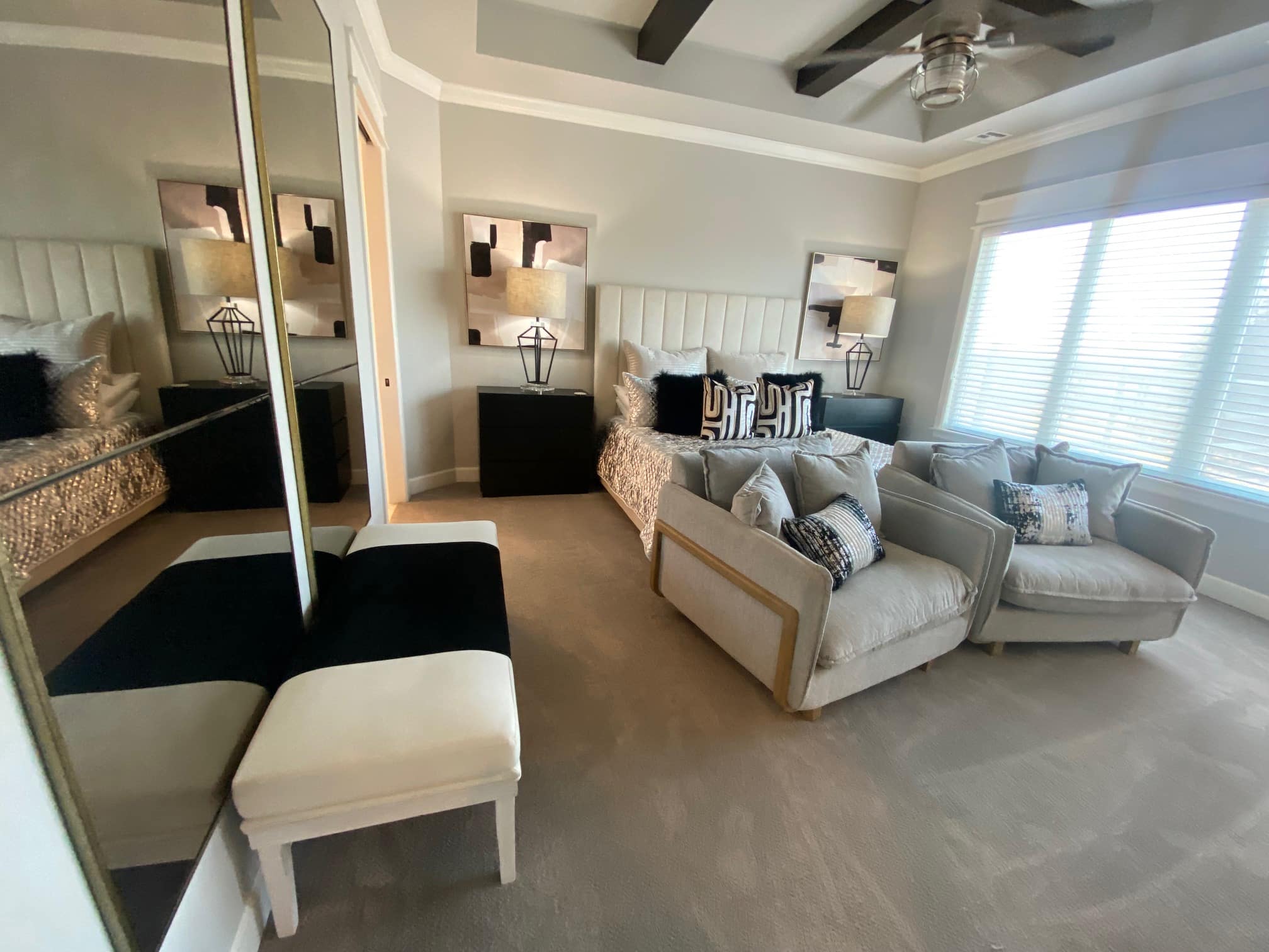
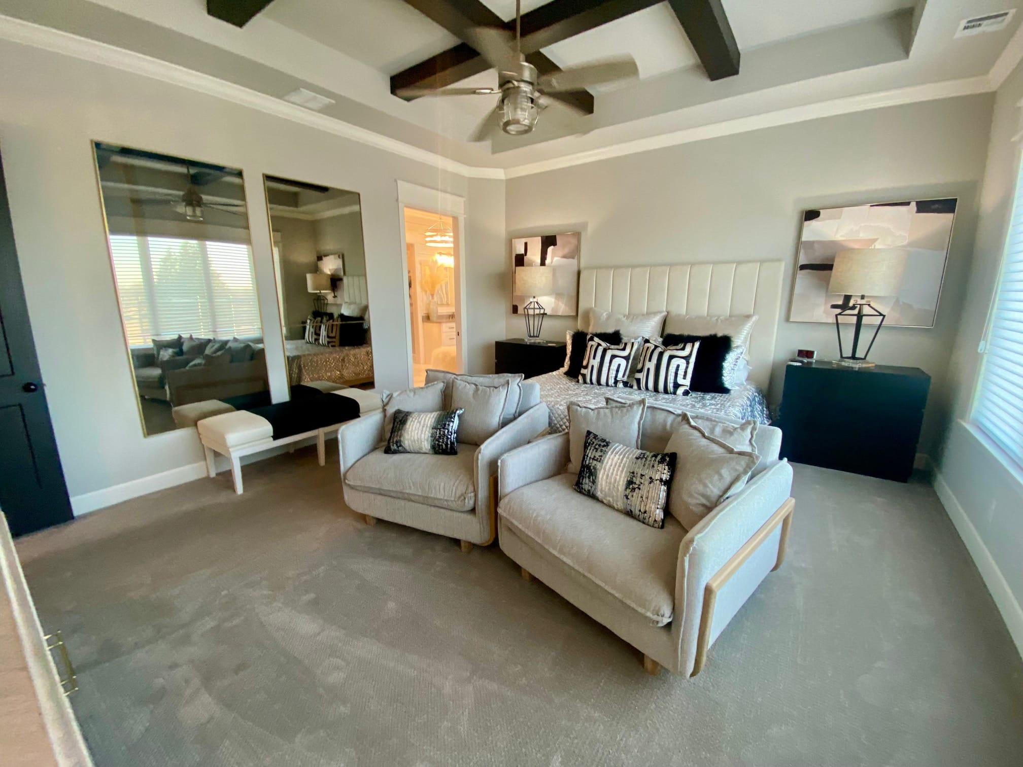
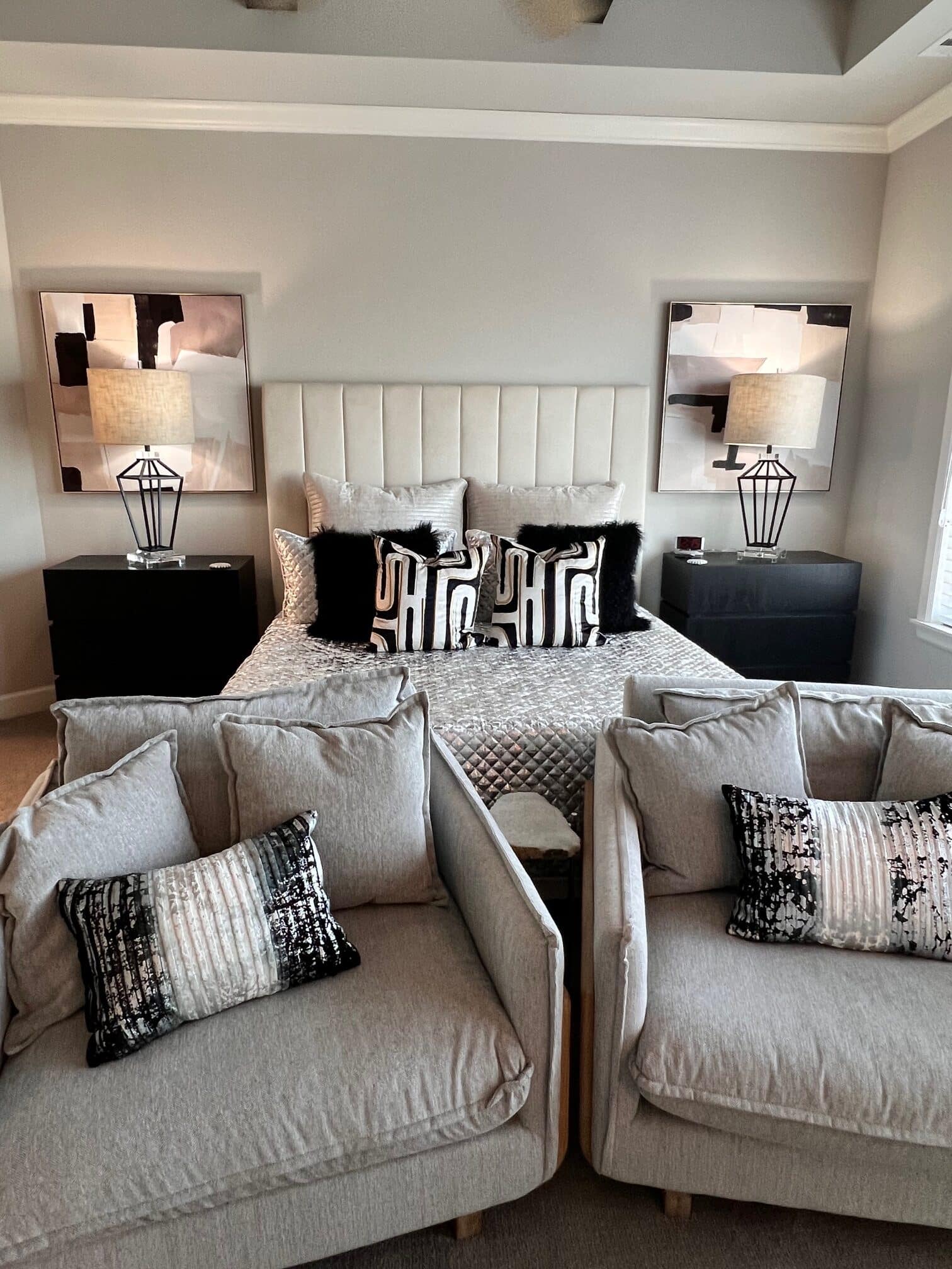
Moving on to the master suite, the plush furnishings adorned with soft textures were carefully chosen to envelop the space in an embrace of luxury and serenity.
Hints of black, white, and grey mingle effortlessly with soft neutral shades, infusing the room with depth and dimension. The two tall mirrors hung on the wall not only reflect the beauty of the space, but practically their presence enhances the room’s light and creates the illusion of a bigger space.
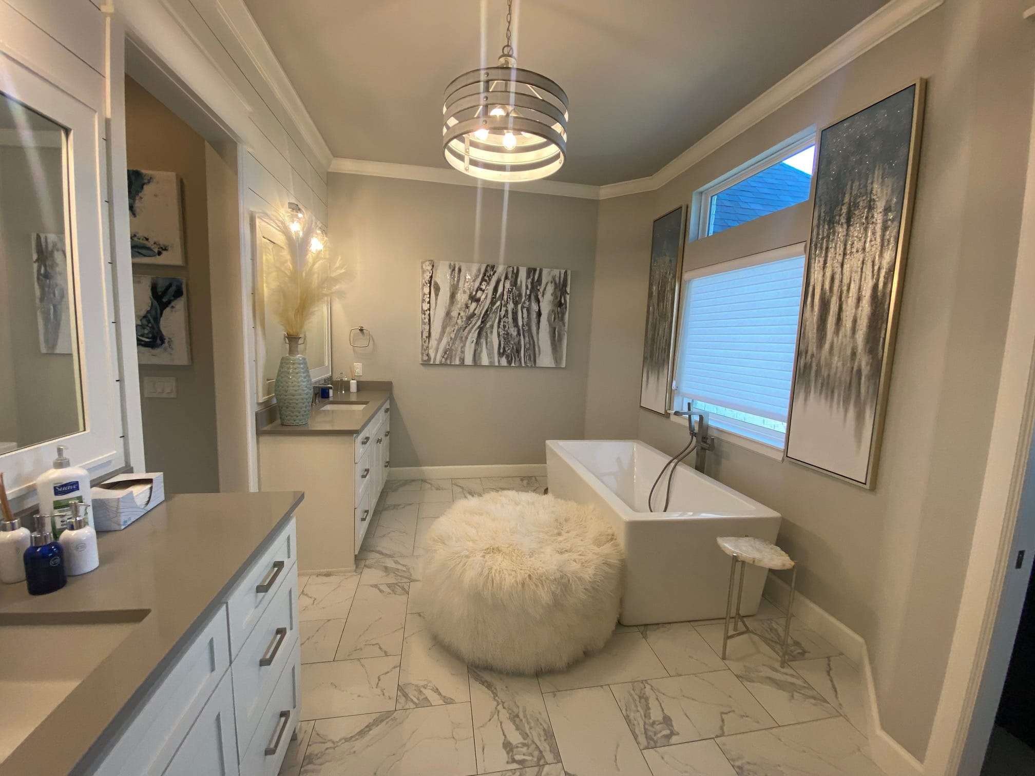
We opted to carry the same texture and tones into the master bathroom. Through art, furniture, and plants, it gives the smooth white marble some contrasting
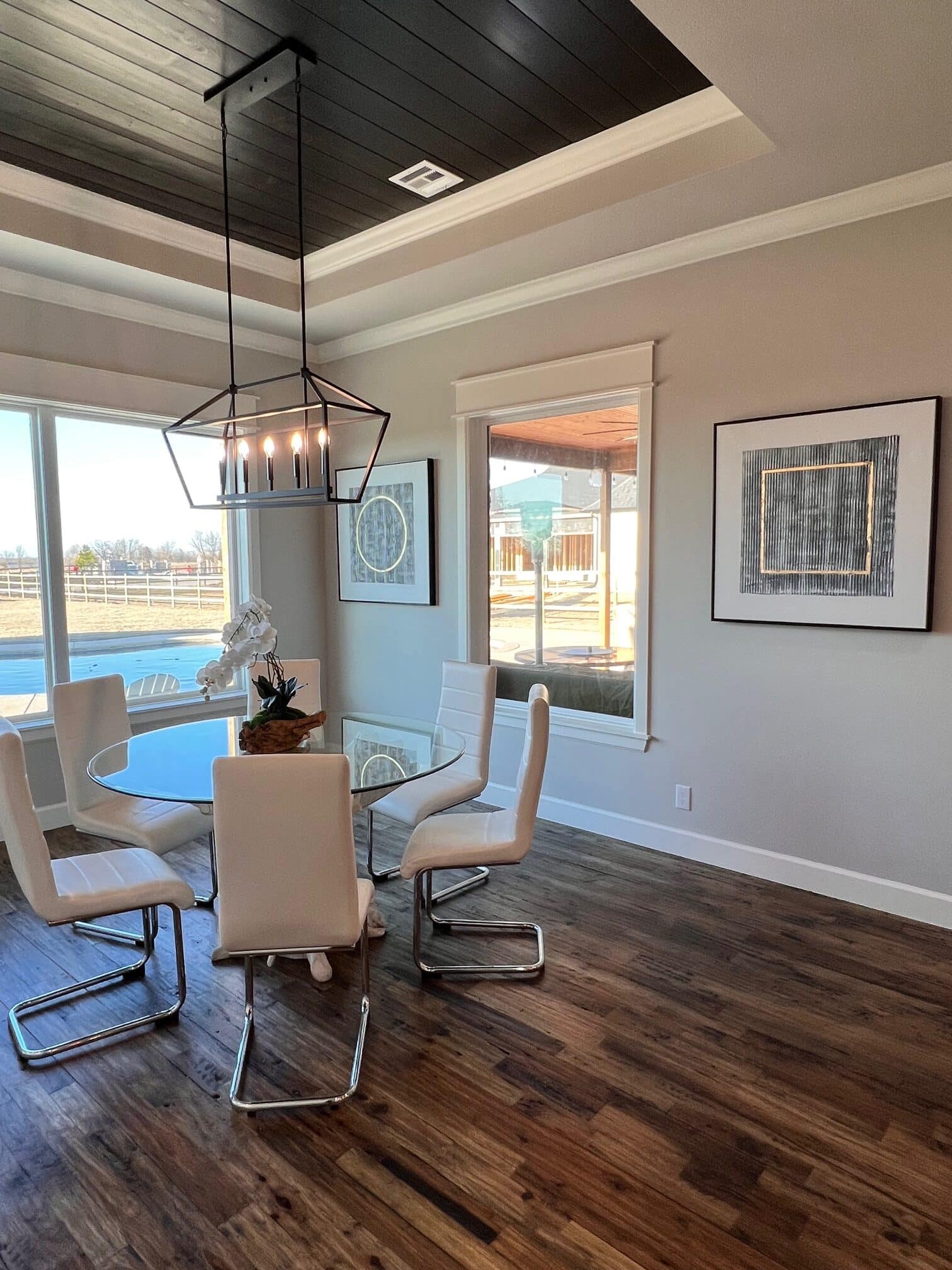
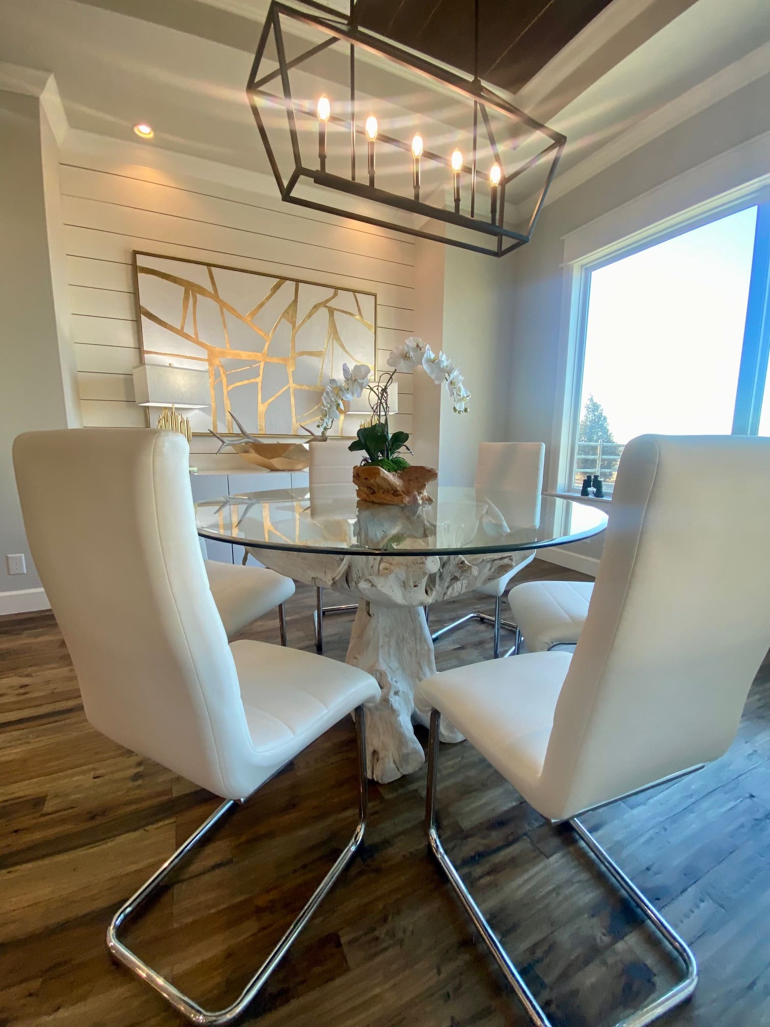
Meanwhile, the dining area emerged as a stunning focal point, complete with a show-stopping piece of art and a thoughtfully curated selection of decor inspired by the natural beauty of the home’s surroundings. Surrounding the table are modern white chairs, their clean lines and minimalist design adding a touch of contemporary sophistication.
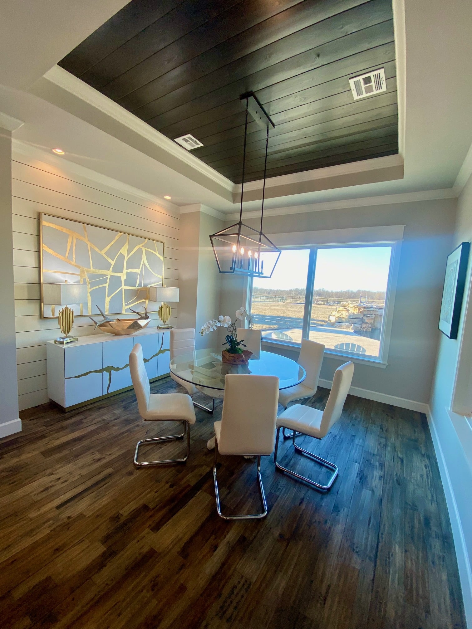
As you look up, your gaze is drawn to the raised ceiling in the middle, painted in rich dark wood—a bold statement that commands attention. In contrast, the rest of the ceiling, adorned in white wood, creates a sense of openness and airiness, balancing the room’s aesthetic with a touch of lightness.
A magnificent gold and white piece of art, with marbled accents, adorns one wall, its mesmerizing pattern echoing the elegance of the marble cabinet below. The cabinet serves as both a functional storage solution and a visual anchor.
Of course all this is not quite as striking without the natural light coming in from the window beside. A perfect place to enjoy the view of the landscape outside.
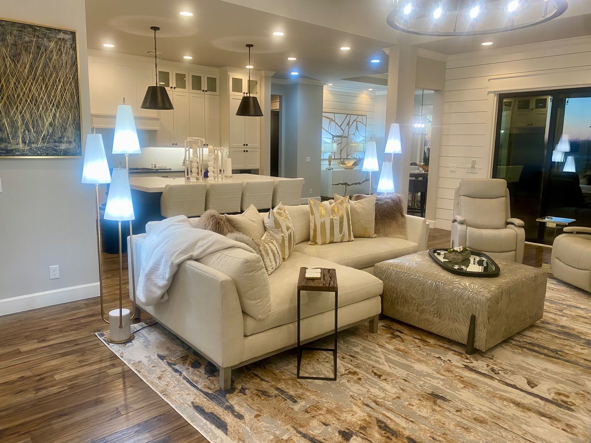
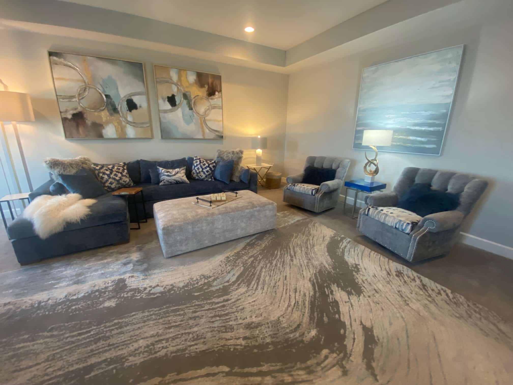
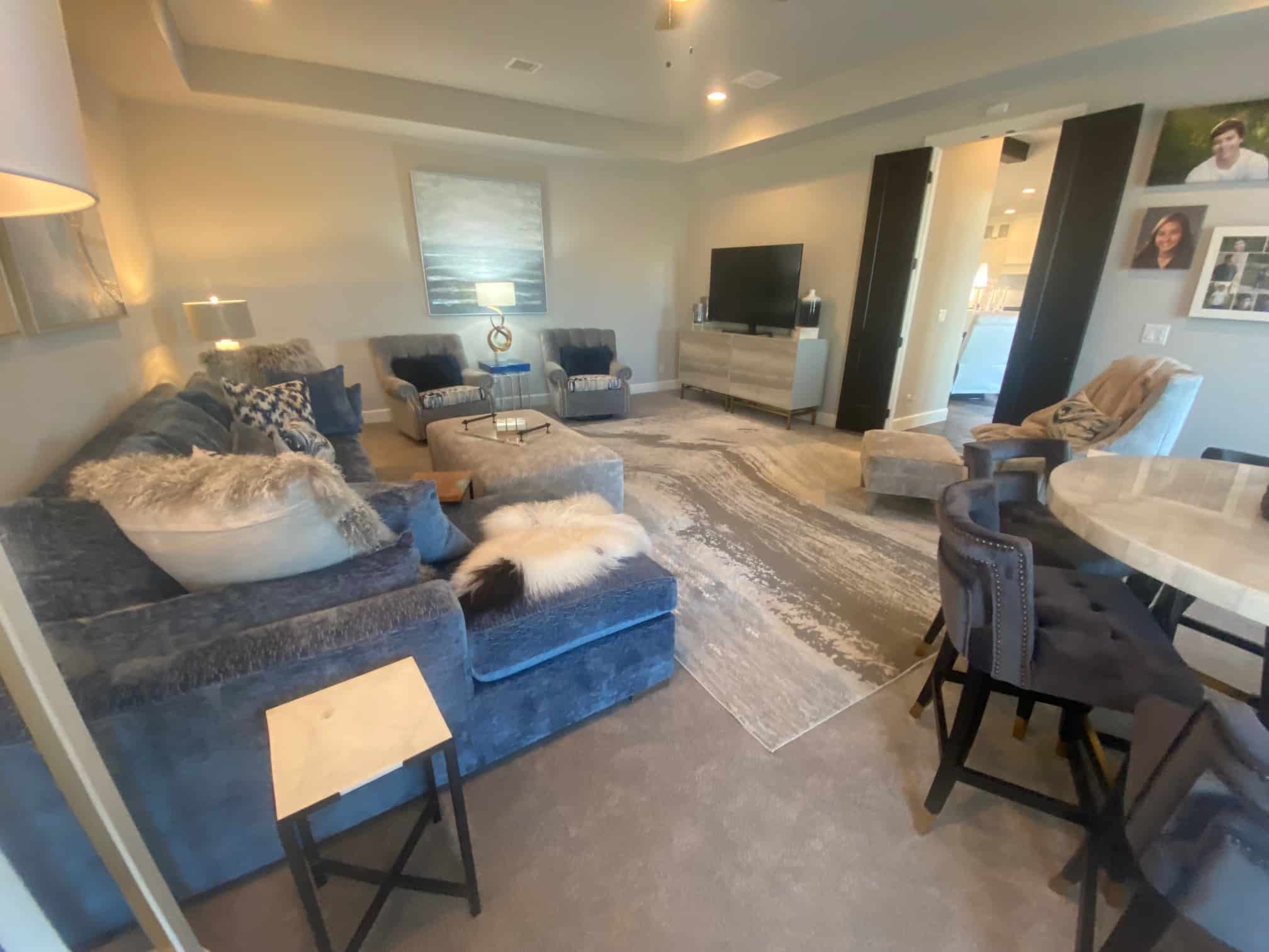
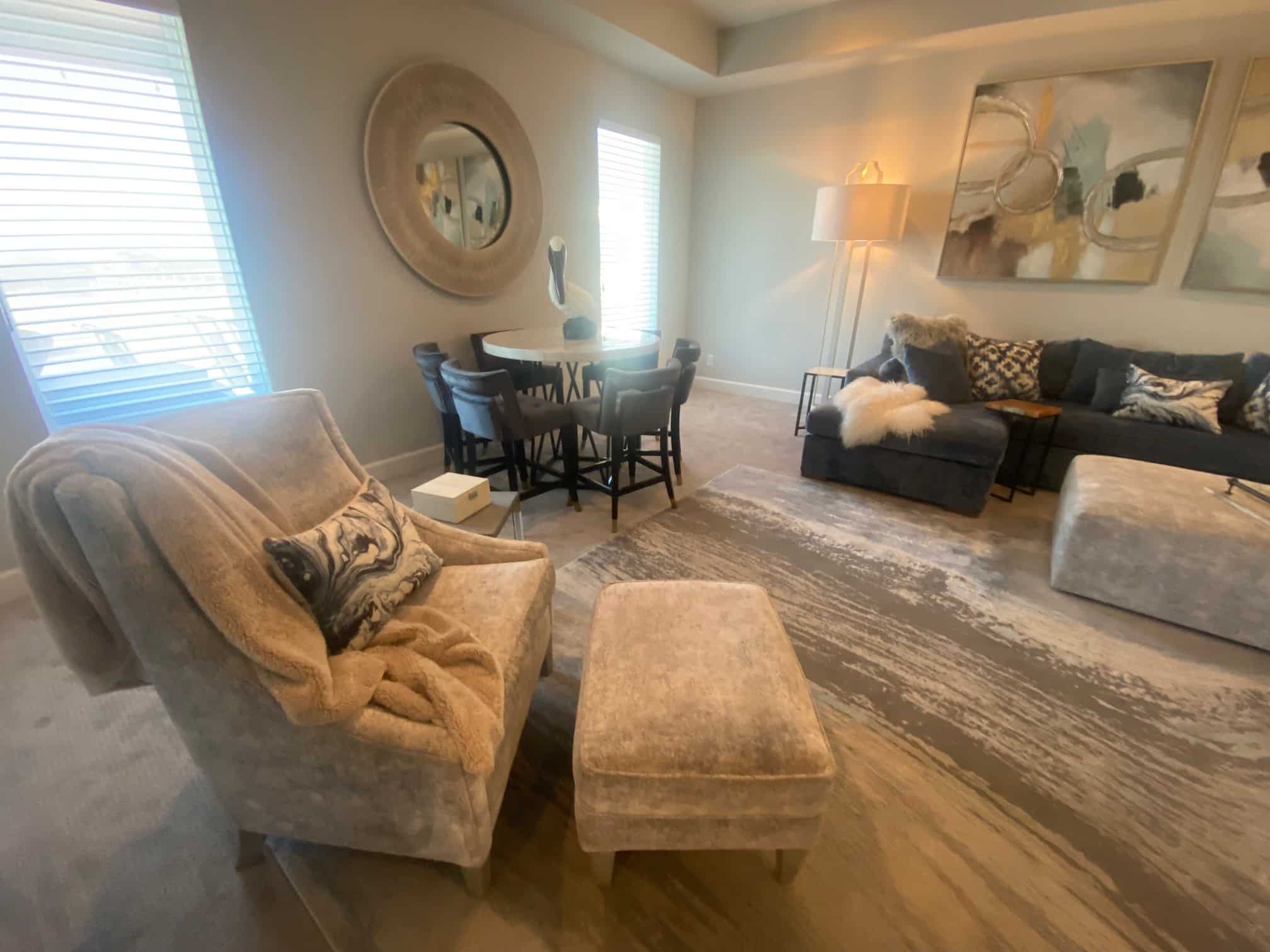
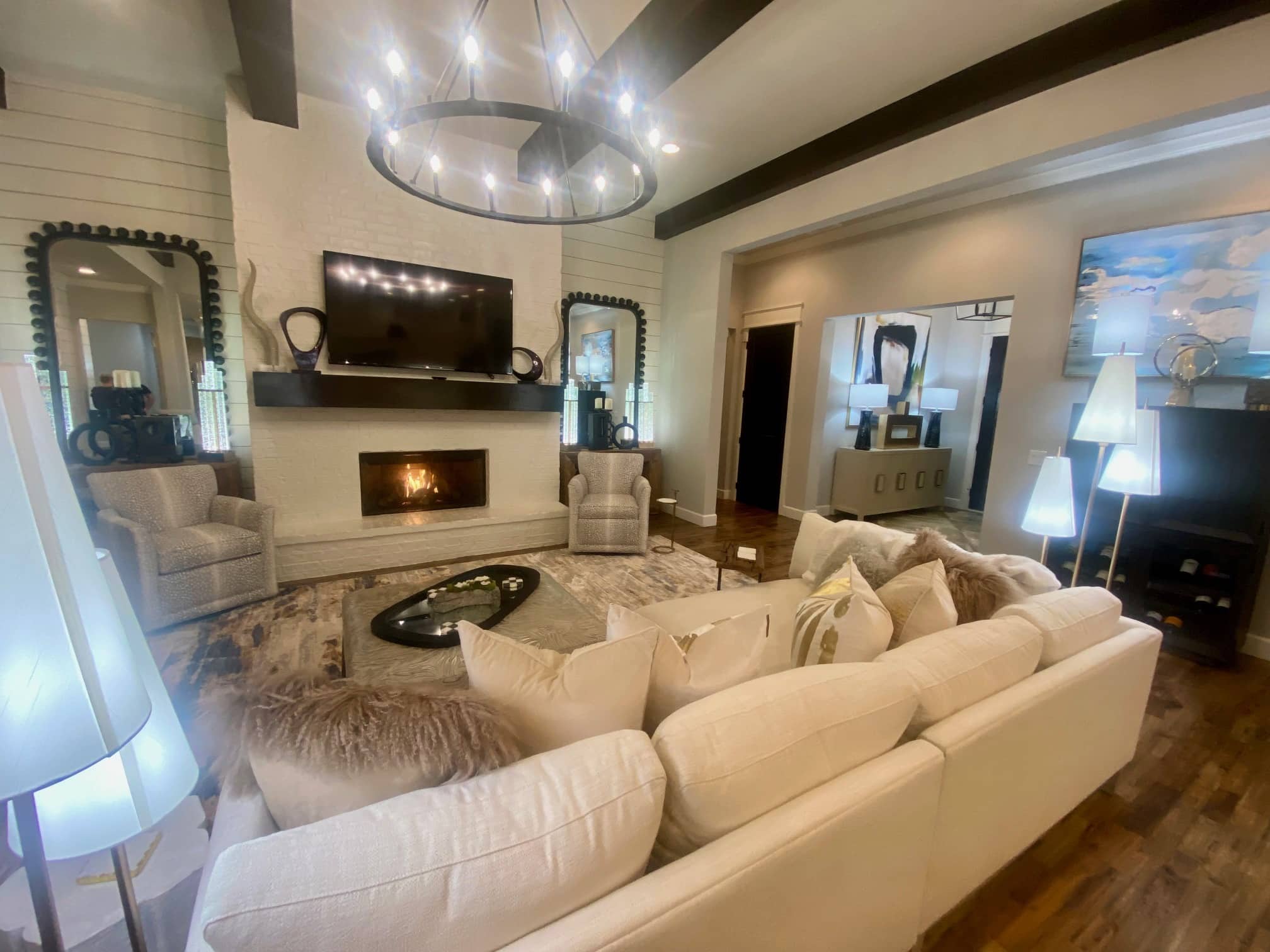
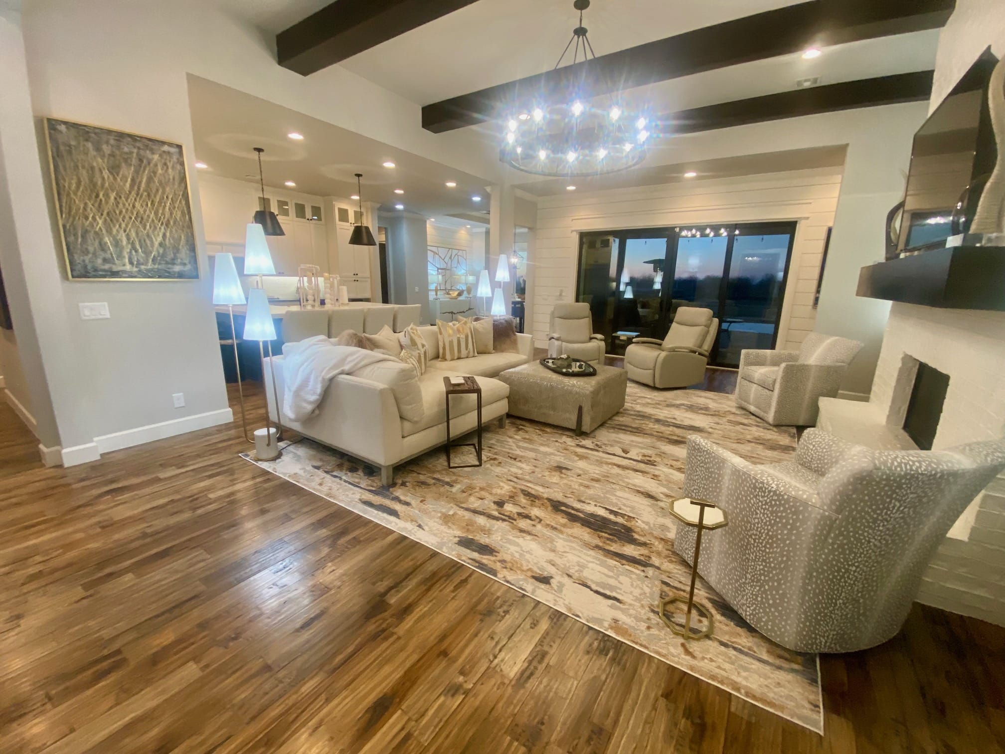
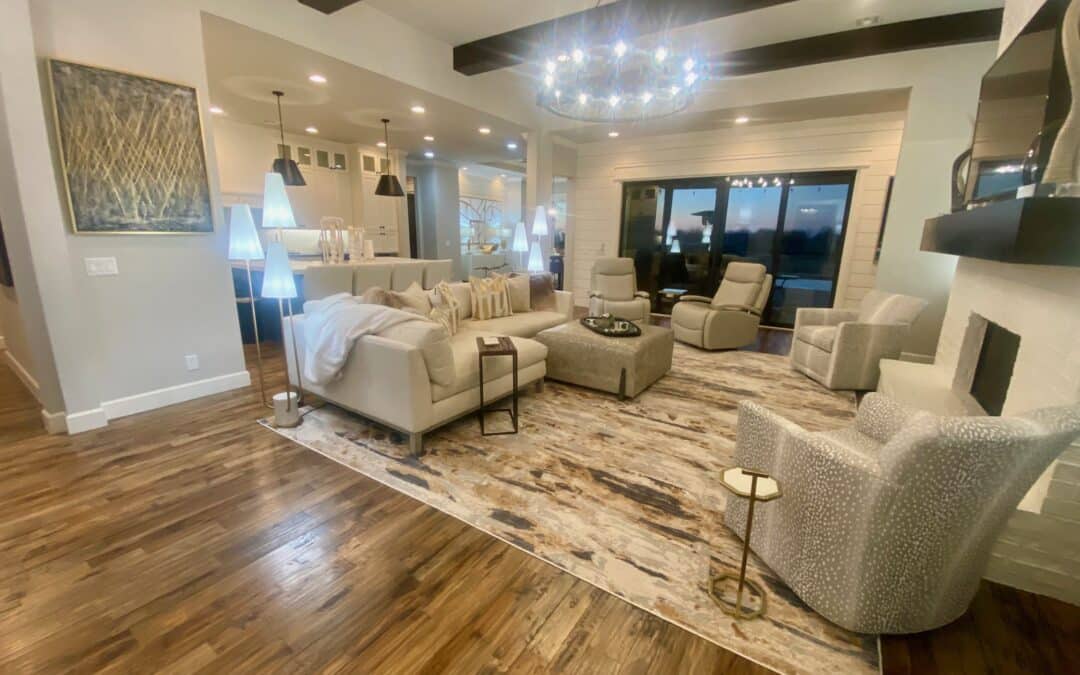
In the heart of the home stands both the family room and living room, two crucial spaces where many spend majority of their time. Here in the family room, oversized sectionals and cozy throws offer ample seating for family movie nights or cozy evenings spent curled up with a good book. The walls, hung with vibrant artwork, also hold cherished family photos to truly make this house a home.
In both the living room and family rooms, every detail was chosen with care and intention, from the furniture to the accessories, to create spaces that are as beautiful as they are functional. The main living room paints a very clear picture of cohesion. From the rugs to the ceiling- everything blends together. With fun patterns and abtract art, the neutral tones keep the room from becoming an eyesore.

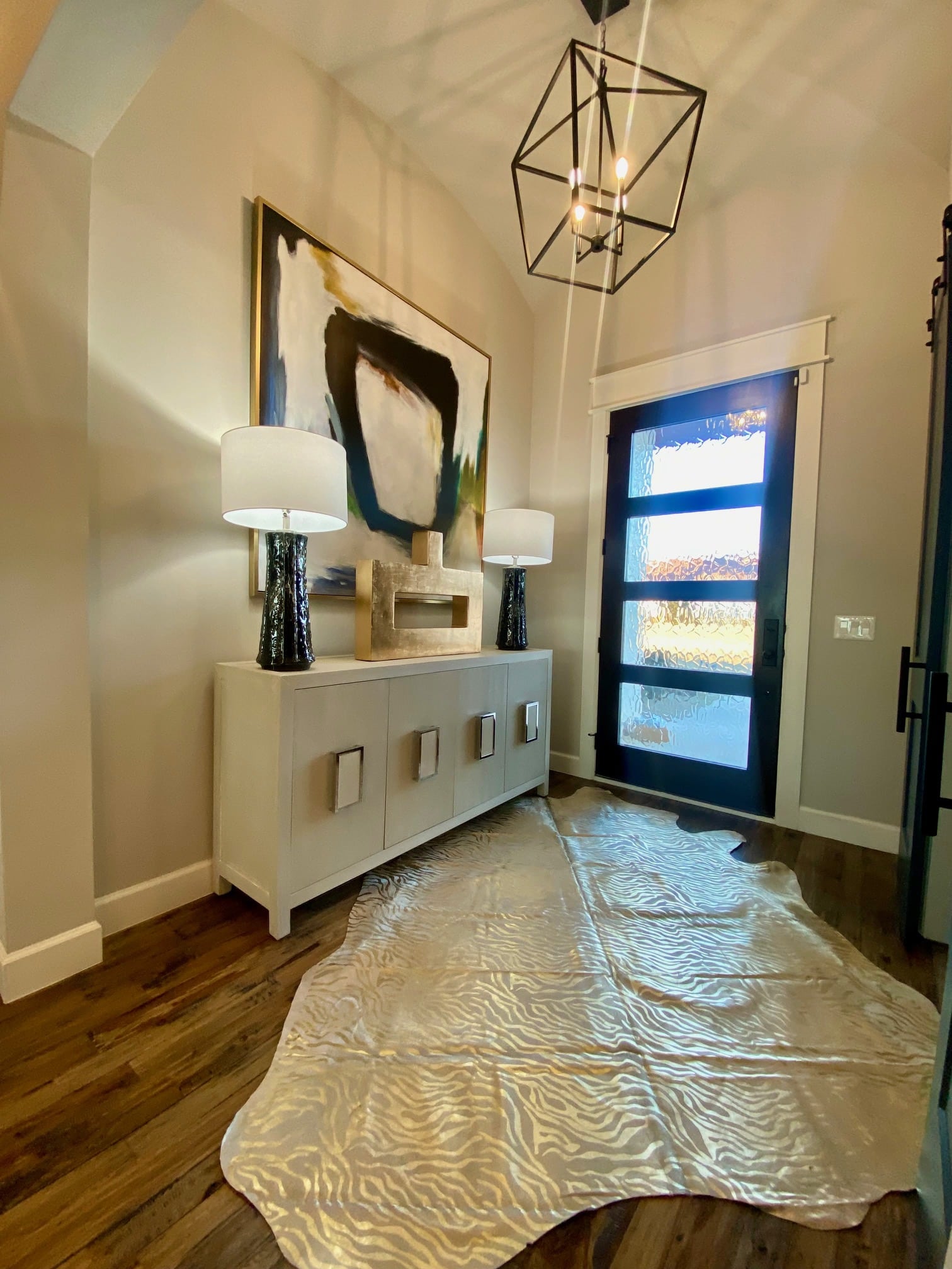
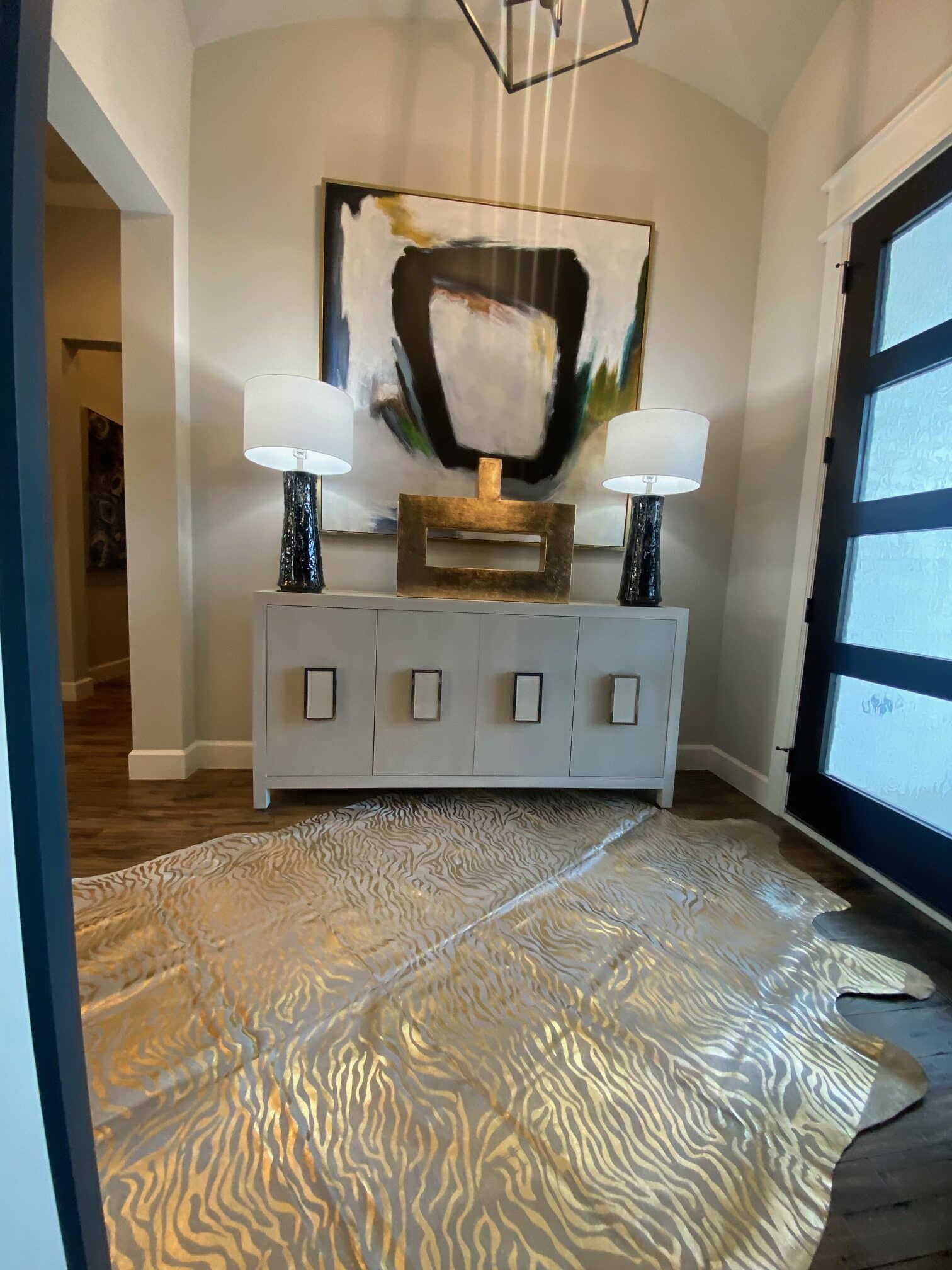
And last but certainly not least, as it’s the first thing you see upon entering this beautiful home, is the entry way. As you step into the entryway, you’re greeted by a captivating display of artistry and style. Dominating the space is a striking piece of abstract art, its vibrant colors and dynamic shapes commanding attention and setting the tone for the rest of the home. The chandelier matches the one hung above the dining room table, once again creating a sense of cohesiveness throughout the space. Beneath your feet is a fun and whimsical rug. The gold reflecting the light coming in through the door, a perfect introduction to the warmth and style that awaits you throughout the home.
Beyond the new furnishings and redesigned spaces, this has been about more than just project—it’s been about creating a place where memories are made, we love how this home turned out.
The best part is that we were able to go to our clients over in Owasso, we love to travel to see what we can do for clientele beyond Grove, OK!
“We are repeat customers for Nuance; even though we feel more like family, and this was a reunion. Once again, Amber and her team were able to make our new house feel like a home.
We asked Amber to not only decorate our common areas, but also our bedrooms. We were curious how she would incorporate our previous Nuance décor into our new farmhouse style structure. She was able to use our existing furniture, artwork and decorations and make them look like they were always a part of this new design and that they belong in this home.
She really listened to what we preferred across the board from the colors and textures of the furniture and bedding to the types of lighting. We told her we loved the tone-on-tone décor and she delivered! The cream colors with the gold and black accents throughout the house are stunning.
It goes without saying that we would highly recommend Amber and the Nuance team and will stay a part of this family.”
-Angela L.
XOXO,

Beautiful!!
Beautiful and balanced with a soothing touch.